Thursday, June 25, 2009

Transformers 2: Racism and Sexism in Disguise.

I didn't have high hopes. Let's establish that first. I also wouldn't have gone if it wasn't someone Else's idea and if someone else hasn't paid.

I saw the first transformers, whenever it came out, and thought it was pretty mediocre. Entertaining to say the least, but too much special effects, fighting, and one of those basic, obvious, predictable story lines: boy character, love interest that's too cool for him, robots that fight each other, good side wins, boy gets girl. The end.

The second transformers was exactly the same, same fighting, same good vs evil, same boy and girl tension, only this time she was getting him to the point where he would tell her he loved her. Don't hate me if I'm naive, but if you're with the same person for 2 years, and doing the dirty surely you should have said I Love you by then. Yes, two years, that's how long supposedly lapsed between movies.

My first issues with this movie is that they mentioned Obama, the economy, and swine flu. They were trying to make it so present day that it just became silly. People don't want to go to the cinema to be reminded of current day politics, economics, or life-threatening diseases. They go to escape their lives and be entertained for a couple of hours.

I still maintain that Transformers 2 is entertaining, but it's not something anyone should ever see twice. Seriously. It's just not that good.

Here comes my real beef though. From the word go they attack women. They turn women into low-IQ'd, idiotic, senseless, sex-objects, that are motivated only by attraction to men.

The mother of the main character is ditsy, and emotional. The girlfriend of the main character is a sex symbol, with pouty face lips, a needy-clingy-obsessive personality and she keeps pulling the most ridiculous faces you've ever seen. Ridiculous.

The other women (all college students) are made out to be sexy, dirty, flirty, and thick as mince with sex on the brain. Seriously, it's like a guy fantasy or something.

The movie is pathetic for the way it treats women and what I want to know is how that kind of stuff can be rated for kids, because of the kind of attitude and impression it will leave with them. If kids are seeing their hero treat woman like a worthless object then that has to be ingrained somewhere in their behavioural system — especially if the kid doesn't come from a home with a good example of a parental relationship.

Above all this is the pathetic portrayal of race. The main character has a Latino room mate who they turn into a coward, an imbecile and a cry baby.

There is also a black soldier and two 'black speaking' robots that make black people out to be stupid, non-readers, filled with stereotypical racist idioms.

There was not one of likable character, there was no one that a kid could aspire to be like and turn out to be a decent individual and that to me should be more of an R rated movie than something with swearing in it.

If a movie is teaching bad principles about society and life that's just as psychologically damaging, if not more so, than seeing something erotic or violent.

I repeat that this movie is entertaining if you want to be vegetablised for 90 hours of your life (it's long), but as far as storyline, character development, and social lessons go, it should be traded in, or brought to the scrap heap. Seriously, transformers, when I was a child, was filled with intellect and solid stories. Neither movie has succeeded in bringing the real cartoon to life. This is all just made for special effects. Lame.

Labels: , , , , , , ,

Thursday, March 26, 2009

The end of graphic design as we know it.

The future of graphic design, as we know it, is bleak. It’s normal for things to evolve, develop, and change as the world that uses them alters, so now it is the time for the change of graphic design. Of course it will be as subtle as all evolution is, but it doesn’t mean that we can’t make predictions.

By qualification I am a graphic designer, but that doesn’t mean much anymore. By need and necessity the average member of planet earth is a graphic designer. This isn’t an unfamiliar concept; it isn’t a new surprise – the foundation and root of graphic design is graphic communication, which is the visual communication of an idea from one person to another (we could even say one thing to another and delve into the realms of animal tracking, paw prints in the mud and the likes, but let’s not). Millions of years of life on the planet has left behind millions of years worth of graphic communication styles from cave paintings and hieroglyphics to quill and parchment; chalk and slate; and now kilobytes, megabytes and gigabytes of messages and information.

The question at hand is where do we go from here? If something doesn’t actually exist then how does it continue to evolve? I can’t make predictions based on technological advances but my predictions come from the present future, as opposed to the distant future. For the past few decades we’ve seen an increase in the amount of graphic design courses in universities and schools, what this, in turn, does is actually churn out a production line of mac/pc/adobe operators rather than designers, but that’s what there is a demand for just now: people who can operate specialist machinery in a particular field, and do it well, to achieve the results desired by their employer and essentially the client.

The recent economic problems that are spanning the international world are going to take their toll on graphic design and communication. We will see a decline in the amount of work being commissioned; there will be a ‘cleansing’ of the design world and only the best will survive; there will be an expectation to drop hourly rates; there will be bankrupt agencies and, again, only the best will survive; and there will be an increase in the amount of online presence that companies have while they look to save money, cut costs and exercise their ability to use free marketing tools.

What this means, and what excites me a lot, is that there will be a decline in the quality of graphic design. Although ‘the best will survive,’ what will actually happen is that the clients will do it themselves. People will grab pens, pencils and paper and draw their own pictures, they will trace, and they will colour, cut, glue, fold and print their own pieces of communication. They will use facebook, twitter, myspace or whatever other new social networking hype appears. They will download copies of the Adobe Creative Suite and teach themselves how to use filters, functions and clipping paths. When we have to cut back on all the other glamorous things like finer foods and clothes then we will also cut back on the amount we spend on glamorous design. I find it an exciting time because over the past few years we’ve seen an increase on the number of coffee-table books and magazines published that contain ‘found’ pieces of typography, or that have personal handwritten messages or confessions. These books are like a sneeze three days before a cold, they have been predicting the future for some time now, and the qualified designer in me is terrified of the financial future, but the creative in me is excited, beyond all reason, to see what new forms of communication emerge out of necessity and need rather than want.

I dare say that Communicating It Yourself (CIY) will revolutionise society and the time we dedicate to actually creating something, it will become an outlet for personal communication of thoughts and opinions and a commercial outlet for advertising and branding. Personal expression has already been occurring for years, for example protests are currently a feast of CIY signs and placards that people use to show their upset and, although it’s on-screen, things like My Space and Live Journal have been around, and popularly used to blog personal opinions, thoughts and happenings, for almost a decade. None of this is a new concept or idea, but the volume of usage and the companies and brands that will start to adopt this new CIY style and, therefore, the places we see CIY, will be an utterly new surprise.

As for the qualified designer they will become teachers and facilitators of design helping and encouraging people to communicate it themselves – and that’s when having a traditional design technique or skill comes in useful.

It’s quite cathartic to dream of such a free-communication society where leading, kerning, font type, size, and colour isn’t electronic but chosen because of what paint and brush or pen was available to hand; or what was within the creative capacity of the person communicating the message. Either way it will definitely put an identity and spirit into something that is currently dying from over production, thievery and obsessed cleanliness.

Labels: ,

Friday, March 20, 2009

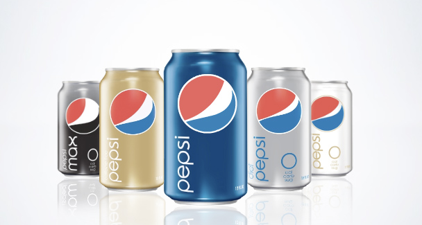
Wow! Pepsi!

Okay, so I might be late on the topic of this, but I was there when the packages started changing and the new Pepsi logo and brand appeared. I remember standing in Smith's Grocery Store on 400 South in Salt Lake debating whether it was a good idea or not.

At first I didn't like it. Too minimalist and 50s/60s for a drinks company. But, it was then pointed out to me, that it stands out from every other drink on the shelf. And it truly does.

While Coca-Cola are going for as much detail as possible, with swirls, fake droplets and visual stimuli galore, Pepsi are giving us a break, keeping it plain, recognisable, and less cluttered.

What it says to me is, chose me, drink me, I won't give you a headache if you look at the can too long.


My one and only qualm now is that the E has a Pepsi swirl in it. That seems like the doing of some marketer or account handler and not the creative who designed it though. It seems out of place and doesn't do anything. No adding or taking away from the brand.

On top of the new logo/bottle/can there are fantastic billboard posters with strong block colours, and large type. I love type. The words Wow, Lol, Awesome etc etc are written as big as they can fit with the pepsi logo sitting in place for the letter O. Enough said. Again, it's an advertising campaign that doesn't overwhelm you. You know what it is, you know what they're saying, everything is clear – there's no need to go all Cluedo about it and stress your brain out trying to piece things together.

My theory is that this the beginning of a new cycle. Gone is the mystery, here comes the answer on a Pepsi-Platter.

Here are the billboards combined into a fantastic flash or after effects video.


I would dare say that this is one of the most 'refreshing' pieces of design ever. The entire idea and concept is phenomonal, and then to coincide and use the refreshing of America because of their new president is just a genius piece of marketing. It's simple. Everything gets changed – everything gets refreshed. It was time for change, and everything is.

To take it further you should check out their Pepsi site, their microsite, and their youtube site.


Labels: , , , , , ,

Tuesday, March 10, 2009

The future of Graphic Design.

I have been trying for two weeks now to write an essay about the future of Graphic design for adbusters. I've just about given up getting what I want to say out, but this YouTube video is pretty much everything I want to say and more.

I have a graphic design degree, but it means nothing, and today people with graphic design degrees are actually mac operators. Art schools churn out mac operators. Have you ever wondered how an academic university can all of a sudden teach graphic design and nothing else that is artistic related? Well it's because they teach people how to use adobe products. And with the increase in pirated adobe products people at home with 'free time' can goodle tutorials and do what ever they want.

Graphic design is essentially communication from one person to another, and that is what it is going back to, as more and more people learn how to use programmes that 'help them design' they are acheiving what they want by cutting out the middle man. Sadly the middle man is the designer, and soon we will all be fighting for the crumbs of jobs.

This video pretty much explains it all. Companies taking marketing into their own hands and using all available mass media, user content controlled sites to get their message across.

And it succeeds.

Labels: , , ,

Wednesday, November 12, 2008

Facebook is the New Coca Cola

The other day I was reading an article in a business magazine and they were trying to predict trends and wax financial about the future of the economy and what would replace the things we already have in society.

One of the questions was about someone trying to predict or create what comes after facebook.

I've been thinking about this for a while, and I have come to realise that my prediction, in this whole affair, is that nothing is going to come after facebook. Well not nothing, there will be things invented and created i'm sure, but nothing is going to over take it.

Here is my reasoning, and we're going to mention MySpace and Bebo and frienster and Hi5 and every other failed networking site as well. MySpace used to be the best thing on the internet. But nothing changed, nothing was updated, nothing was new, there was no user to client contact and thus no improvements in the service (and still, there's no new beneficial improvement; all the new things we saw on facebook a year before).

I'm not the biggest fan of facebook, which you wouldn't guess considering the amount of hours I spend on it. The reason I'm not a fan is the amount of hours. It has me trapped, I want to know if someone has posted new pictures, I want to know if so and so is attending the event I'm thinking of going to, I want to know how my friends are doing and what they are up to all day.

I find myself refreshing the page, just in case, about a million times a day. It's now a habit. Those are my reasons for not liking it. I also fear that it will get too big, that there will be too much information and we will all explode from an information over-load. My other beef with social networking sites in general is that they mess with the general order and natural cycle of friends. I can now stay in touch with the people that bullied me in high school, or the people that I knew when i was 5 years old and I could still play out in the street and not get kidnapped.

But back to my theory. Myspace has never changed, it was replaced, and now, rather than realise that it is actually used for music more than networking, it continues to wriggle the knife further into its own heart. It's time it reinvented itself and came up with new ideas rathe than ideas pinched from facebook.

Facebook on the other hand updated their site, changed the layout, realised there was a problem with information display and did something about it. At first people could choose to change sites, eventually everyone had to. And they had the attitude of 'you will get used to it' when people moaned and complained. Now, I quite like it. people hate change, but once they know it for it a while they won't remember what was before. And that is what they knew and what they did.

The people behind facebook and who are working constantly on facebook are not stupid, they are smart, and they know how to stay alive. If they had just left things the way they were all myspace hell might have broken loose and they would be burried in the dust like friendster and hi5.

So my theory is that facebook is going to be like coca-cola, it's not going anywhere. It will have competetors, there will be cheaper versions, but it will always capture the main market, and it's not because the product has every changed. No, it has always tasted the same, just the marketing and the look changed. The logo progressed, the advertising was clever, and always different.

So as long as facebook keeps the product the same, ie. makes sure it's ALWAYS a social networking site that is easy to use and clutter free, but changes the look to keep up with technology then my bet is that it's not going anywhere, and that it will become a brand like Apple, McDonalds, Nike and Coca Cola.

Labels: , , , , , , ,

IDEO Questions.

Although I don't sit and post the ideo daily widget questions I do think about them.

here are some of my thoughts over the past few days.

November 8th, What is your TV really saying to you?

It tells me that other people's lives are far more interesting than mine and that cool gimmicks and witty narration is what we should aspire to have in the background. Queue Facebook and their opportunity to narrate your life with as much humour as you want.

November 9th, If you started a magazine what would it be about?

Being happy and how to be happy without stuff, things, and stuff and things.

November 10th, How is being done in China?

Illegally, realistically, quickly, necessarily, with less pay, with less decoration, with less benefits, with less need, with greater need, with less want, with MORE spirituality. (and a lot of lead in the head.)

November 11th, Will we always aspire to youth?

yes, because we never know that we're growing up. It just happens, and we will continue to do in our older years what we did in our youthful years. Just because we don't know any differently. I don't think we will consciously aspire to it, we will just do it.

But to take the thought to the cosmetic level. When love is involved, and jealousy, and suspicion. When trust is not in abundance then youth is all we have as a weapon, that we believe to be our weapon. How can we compete otherwise?

November 12th, What does sharing look like 5 years from now?

Ideallistically, the foundation of society.

Realistically, non-existant. I think in 5 years hyperindividualism will just increase. It will be longer until we see the masses actually caring.

And

November 5th, How old would you be if you didn't know how old you are?

Twenty six. One year older than I am now, because I've always seen 26 year olds as people that drink hot things in cafe, read books, and talk about things that appear to matter as well as the idle chit chat too. It's an illusion, but that's the stage I want to be at, and the stage I have been at for a few years. But every now and then I still have a streak of weakness.

Saturday, October 25, 2008

Another Whinny Essay... seriously. I need to stop.

I just submitted this to adbusters. Not my finest piece of writing, but let's face it, I am slacking these days. Lack of reading equals lack of quality writing. Alas. Enjoy.

A Call For Superheroes.

Now is the time to forget the rules; all bets are off. Now is the time to shed our contemporary consumer society costumes, and truly reveal the superheroes within ourselves.

The concept of superheroes is not unusual, they have been part of our fantasy culture for decades and they cross international cultures and barriers. I would go as far as saying that as long as man has existed he has always dreamed of having super-natural powers and abilities that set him apart from everyone else and give him authority to help and save the world, or at least help with his labour.

What’s not so commonly recognised is the similarities of superheroes to the contemporary consumer world. Superheroes don masks, capes and lycra snug-fitting outfits and alter their identities to conceal who they are, or rather augment who they want to be: a crime fighter; a life saver; a bringer of justice. We are guilty of doing such things with our own purchases, and our own everyday clothes. We buy things that will make us feel like who we want to be and that we think will display our inner personality to the outside world. Really we are just fitting into genres and shoe-horning our lives into a brand we think we identify with. We have been behaving like superficial superheroes for decades, but this is now a call for real superheroes: for people to realise their potential and realise the difference they can make in this world.

No, we don’t have any kind of super natural powers, but I don’t think that possessing abilities beyond reality would actually help, but more so hinder. This is up to us. We don’t need a mask, a cape, or any kind of special outfit. We don’t need powers, or to have been born on another planet. We really don’t need to conceal our identities or suppress who we are any longer. The pressure to conform to a certain genre and to appeal to the people already leading that niche of society has reached boiling point and we can now free ourselves. It’s time to let our superhero selves reign supreme. We need to save the planet, and we need to do it as superheroes.

Let’s shed our brands, and our obsession with spending. Let’s start to help the people we know and the people we don’t know; let’s talk to our neighbours and save society; let’s go outside and experience nature and appreciate how intrinsically linked to it we are; let’s make amends with our family and friends and have no animosity; let’s look at the sky and realise how wonderful and beautiful it is; let’s not fear our own culture, anyone else’s culture and especially not religion; let’s stop working so many hours, and stop wanting gadgets, brands, and things beyond need; let’s say no more to being psychologically tormented and depressed by the cold world we have invented; let’s listen to the young and the old; let’s cook real food and no longer be a slave to work and the microwave meals made for convenience; let’s realise that the things we own will not afford us one iota of real happiness; let’s design things that will help people rather than things to make money; let’s put down the TV remote and read books; let’s enjoy life and realise that memories are what make it; let’s learn from each other and never stop learning; let’s care about the world; let’s care about people; let’s be happy; let’s care about oppression, war, and let’s no longer stand for corruption among our ‘leaders’. We have the power to rise up and take back the planet that is ours. Let’s change the world, let’s be superheroes – together.

Labels: , , , , , ,